Swarm Design System Documentation
Button
Buttons are a fundamental component and primarily how users trigger actions. They can be customized by sizes and color to communicate importance and content heirarchy.
Default
This style is the most common in the product and is a good starting point in many cases.
Primary
Use this style for the most important actions within an experience. Only one primary button should be used per screen.
Neutral
To reduce the visual weight and importance of a button, use this style.
Bordered
This style has the least visual weight, while still maintaining a button aesthetic.
Inverted
Use this style when an action must be overlayed on an image or a dark or saturated background.
Disabled
When an action is not available to the user, use this style.
Buttons with icons
Icons can easily be added to any button size. The icon can be configured to appear to the right or left, as well as on its own.
Text only buttons
It is also possible to reset the button style to remove its inherent visual properties.
<>
  <Button>Default</Button>
  <Button primary>Primary</Button>
  <Button neutral>Neutral</Button>
  <Button bordered>Bordered</Button>
  <Button icon="send">Send message</Button>
  <Button large iconOnly>
    <Search/>
  </Button>
  <br/><br/>
  <Button neutral grow icon="InfoCircled">Fill the space</Button>
</>
Props
| Name | Type | Required? | Default | Description |
|---|---|---|---|---|
bordered | boolean | optional | none | The bordered button |
className | string | optional | none | Classes for additional styles to be applied |
disabled | boolean | optional | none | Indicates whether the button is disabled or not |
icon | string | optional | none | Supports solid icon shapes found at https://swarm-docs.now.sh/Foundations/Icons. This is the recommended way to use icons in buttons. |
iconOnly | boolean | optional | none | Supports icon only padding for using icons as children rather than by passing an icon prop. Using the icon prop is preferred. |
reset | boolean | optional | none | Strips all styles from the button |
inverted | boolean | optional | none | Inverted styles for dark backgrounds |
neutral | boolean | optional | none | The neutral style |
onClick | signature | optional | none | The function invoked when interacting with Button |
primary | boolean | optional | none | The primary style |
right | boolean | optional | none | Aligns the icon to the right |
size | union | optional | none | The size of the button. supports "small", "large", & "default" |
large | boolean | optional | none | The large button size |
small | boolean | optional | none | Use the small button size |
grow | boolean | optional | none | Grow button to 100% width (full width) |
forwardedRef | union | optional | none | |
children | ReactReactNode | optional | none | Content of button |
Anatomy
All button styles and sizes share the same anatomy.
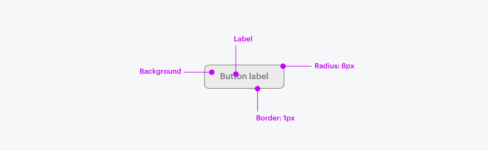
Label
Button labels should be short and actionable. Label attributes are driven by the selected button style and size.
Border
All buttons have a solid 1px border, though some styles require the same color for background and border, hiding the presence of the border.
Background
Button style determines its background color and opacity.
Radius
All buttons in all sizes and viewports have an 8px border radius.
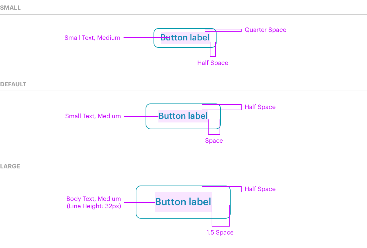
Sizing
Size & Height
Any button can be configured to one of three distinct sizes. Size dictates label text style and top/bottom padding. Button padding uses spacing variables which are dynamic based on viewport.
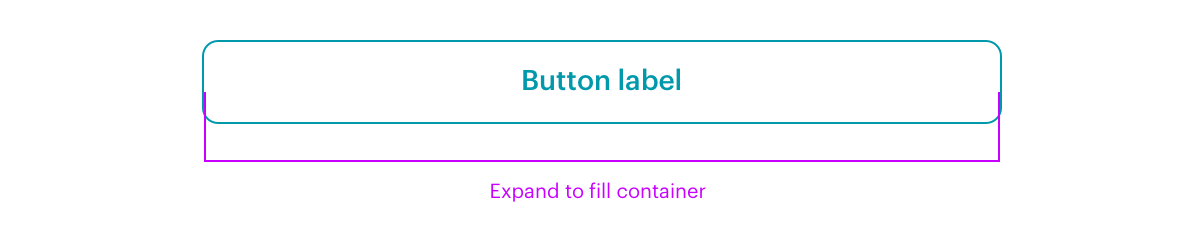
Width
Buttons will inherit their left and right padding from their size. Use the grow attribute to expand a button to fill its container.
a11y
Keyboard interactions
The button action should be triggered by the enter and space keys.
Content Guidelines
Button labels
Should clearly indicate what will happen if the user clicks on them. They should be easy to scan and comprehend.
- Keep it scannable: Avoid articles like "a" and "the"
- Use sentence case
- Don't use first person to speak from the user's point of view (Sign up vs. Sign me up!)
- No ampersands or end punctuation (Agree and continue vs. Agree & continue)
- Make priorities clear: Never present the user with more than one primary action